Thursday, 30 October 2008

_Minimal Grafiks


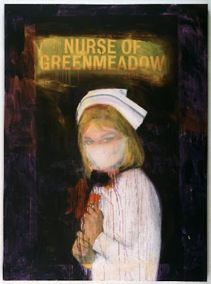
_Lovely Agressively minimal graphics - from fashion spreads to strange tribal graphics and even T-shirt graphics. I like the way they're definately referencing Modernist and Soviet graphics but still seem to have a modern twist to them

_Further


_

_Boy shots by Samuel Zakuto, I just got to thinking about how ace his work was when I mentioned it below, so went seaching, and found these - I love how Zakuto's style looks like fleeting moments with these boys, like he just saw them on the street thought they were cute and took a few shots of them, and then never see's them again. I dont knoew if this is the case, but its kinda a nice idea.

_Coco


_Lovely bit of Chanel graphics/layout/rendering (?!) - I how no idea where I found this - it was just lurking in a file on my desktop, cute though.

_Heart


_He Magazine, current issue, been out about 4 months, pulled it back out the other day, and forgot how much I loved this shoot of Chloe Sevigny's range for 'Opening Ceremony' kind of really 90's New York Rude Girl - She looks freakin ACE.

_Thrift Books


_So I am currently Travelling back from Yorkshire on a shuttle train to the city. But while I was home I got chance to visit my favourite charity shop in Harrogate, which is the best place for thrift, as everyone is pretty minted, so the stuff the throw out is damn good, and when they empty rich dead peoples houses you can have a field day on anything from taxidermy and 'Homemaker' (the 1950's crockery range) to vintage Yves Saint Laurent and Ossie Clark (all of which I have found before) - anyways, on this visit I went to my favourite Charity Book Shop and picked up these little beauties above - The 'African Hair' is currently inspiring me no end, and the amazing 1950's graphics and super colour imagery of the others are pure genius.

_Exitement


_For this tonight!
At Shunt,
I may burst,
To actually meet Dr Anger!

Hell Yeah.

_Ryan


_By Samuel Zakuto - hot. As is most of Zakuto's 'boy photography'.

Monday, 27 October 2008

_Organised Life Desk


When I was back it Yorkshire last week I had a glorious few days running through my 'post-it' addiction, and moved all ideas from scrappy bits of paper and random lists into a lovely new Moleskine.

Soul Soothing, and VERY inspiring.

_WERK 15


_So, I have a bit of a thing for the WERK publications, but this issue is particulary ace. If you cant afford the £40.00 price tag, just head to Claire Du Rouen on Charing Cross Road and check it out. Its 'design studio' heaven, from M/M to Jop. Plus this seasons cover is lovely - hand painted white on white. Brilliant.

_Anti


_A lovely bit of 'Anti-Grafiks', kind of reminds me of the collage work of Dash Snow, but non the less, Ace.

Check out more of this young desingers work at www.mudchickenart.com

Thursday, 23 October 2008

_Too fine


_Frank Carter...
God.

And the nicest bit is - I loved this photo before I realized it was him, taken from i-D last year - his red hair works so well with the 'autumn tinted' wallpaper. And the tough stickers - dont even start me.

_Matt From San Francisco...


_Has the nicest house.
Its just mellow,
and well designed,
and easy.
It appears really open plan and clean,
Yet cosy filled with personal bits.

Brilliant.

_Found this the other day . . .


_I found this on ebay the other day, with a buy it now price of 400.00 - GUTTED. If i had a big enough lounge this bad boy would be AMAZING.

Damn it.

_If Karl owned a chicken farm . . .


_Fistly it would be the best thing ever.
Secondly those chickens would be the flyest chickens in the coop.
And thirdly - they would lay eggs like this: matt white outside, black gloss inside.
Oh, except in my head they have double linked 'C's embossed into them.

...In my dreams.

_Enjoyment Back North


_So due to unforeseen circumstances I am having to travel back to the Yorskire Dales on Tuesday. But have decided to make the 48 hour trip as enjoyable as possible, and on wednesday evening am headed up to the home of 'Burberry's' head Christopher Bailey - Salt Aire, In order to go to 'Salts Mill' - the home town museum/gallery space of British turned LA based Artist David Hockney, I have an absolute addiction to the mill and have since being a little boy - it just seems a very organic space, and the work presented is honest and inspiring.

Cant wait.

_Geometry


_Today I spent part my day researching Geometry and the ways in which the 'geometric look' can inspire window designs. So I thought I'd share some of my favourite bits of the inspiration.

_Handmade House


_In Iceland, YES PLEASE.
Amazing to wake up here every morning.
Or even just for a little while.
With a cute boy.
Ace.

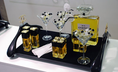
_Chanel at Dover Street


_Some of you may remember me blogging about this back in June, but its only recently that I found good images of the exhibition/installation from Dover street. So even though it was only on store for 3 weeks - I thought I'd put them with the feature on it from 'Wallpaper*' magazine - Enjoy.

"To mark the arrival of the Metiers d’Arts Paris-Londres Collection, Chanel will be available, from today until 26 June, at London’s Dover Street Market.

This is particularly newsworthy for, although Comme des Garçon’s London store has already become the prize positioning for otherwise-hard-to-come-by brands like Pierre Hardy, Azzedine Alaïa and Ganyru, Chanel is notoriously precious about guarding their distribution (the ready-to-wear collection is only ever sold through Chanel boutiques and Chanel concessions, bar one exception when some pieces were sold at Colette back in 2003).

The Metiers d’Arts Paris-Londres Collection was shown at a special fashion show in London in December at the Phillips de Pury headquarters in Victoria. The collection is a special showcase for the decorative crafts of the Parisian ateliers that have worked with Chanel for decades (and that the company have recently acquired): Desrues the costume jewellers, Lesage the embroiderers, milliner Michel, feather artisan Lemarié, cobbler Massaro, floral designer Guillet, and silversmith Goosens.
As breaking their rules about distribution is such a major move for the brand, the collections arrival is anything but low key, more of an total invasion and a complete integration into the entire store, from Rose Bakery right at the top right down to the shop windows on Dover Street. A special visual team from Paris, who normally work on the fashion show sets, have left their mark throughout the store.

The Artek chairs that normally bedeck the café have been replaced with the spindly chairs that mimicked dressing room chairs topped with coat hangers with intertwining C’s, first made for the show. The magazines (including Wallpaper*) have been brushed aside for two weeks and replaced with an entire library of tomes on Chanel. The view from the roof terrace is now a billboard, on an adjoining roof, featuring a pink Eiffel Tower with a life-size cut out of Karl Lagerfeld (a further 20 are distributed through out the store).

Also on Four is a bag and fragrance bar, featuring limited edition bags in Union jack patterns. The third floor features a corner with jewellery made by Desrues the costume jewellers including a jewelled vest that will set you back 30,000 pounds. The second floor has a selection of men’s knitwear and on one there are the adorable bowler hats (watch them be the first to sell out).

Downstairs, Chanel have built a little French house complete with TV aerial and chimney. The maison comes with a stall set up outside, under a white awning with a fabulous collection of accessories and jewellery, including belts with the houses intertwining C’s in Union Jack enamel and earrings with tiny red Routemaster buses. Apparently Mademoiselle Chanel herself used to have stall tables outside her Paris store selling perfumes.

The whole thing, brilliantly done of course, seems completely at home amongst the avant-guard merchandise of Comme des Garçons, Junya Watanabe and Christopher Kane - which illustrates the depth of the allure and appeal of Chanel."

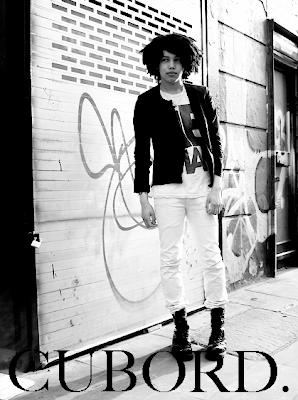
_Cubord


_I found a load of these the other day: A fanzine called 'Cubord' that I started to produce in my second year of uni and carried on until my fourth. Its actually due to these little photocopy fanzines on 80gsm dusky pink stock that I ended up as a photographer for Streetpeeper.com, then doing 'Nylon' and 'Guylon' magazines street style, then ending up being lucky enough to exhibit at 'Collette' in Paris during Fashion Week in February this year, in an exhibition called 'from the street to the night' with the opening attended by non other than Mr. Lagerfeld himself - Saying that, I think it may be time for a re-design and relaunch

_'Coming to America' Cut Up


_Ace bit of cut and paste, using the before and after imagery of Eddie Murphy in the 1988 film 'Coming to America' - possibly one of my favourite films ever. Brilliant.

_awww, Kieth and his boy: Heart


_Just a lovely bit of graphics - A super pixilated polaroid image of Keith Haring with his last Boyfriend Gilbert Vazques, taking him to his high school prom (No, im not kidding ;)

Too cute.

_Frank Stella for BMW


_I found this the other day - An artist I was obsessed with as a teenager for his 'over styled, over sized and overly painted' aestherics - Ace.

This was the second BMW 'Art Car' created by Frank Stella in 1976, the American artist and a passionate motor racing fan, who used a black and white square grid pattern taking inspiration from the technical graph-paper, and took it to this BMW 3.0 CSL coupé.

During his BMW Art Car conception, the American artist switched gears from his usual random style of painting and sought inspiration for the vehicle’s technical aura. The result: a black and white square quid with an evenness and precision reminiscent of oversized graph paper.

Within this grid, pattern-like, dotted lines run across the bodywork, suggesting that Stella may have wished to cut out the car and reassemble it in a new shape.

The grid pattern - a feature of both Stella’s earlier and later creative period - is often used by him as a kind of stage upon which a painted drama takes place. By way of contrast, the paintwork he created specially for the Le Mans race is not a stage, but the action itself.

_Tomorrow is . . .


_My Birthday!

I'm very excited, but just for those of you who are stuck on what to treat me to . . . I have posted a small selection of suggestions above ;)

we have:
_Pantone Mugs (preferred grey tones)
_Raf for Eastpack 'crushed backpack' (weekend bag would make me so happy)
_Green leather hologram wallet from Comme Des Garcons
_Any form of white porcelain to add to my ever growing collection.
_CDGMAN2 - I actually have just re-bought this, its the candles I love.
_Double hit here - anything by Bruce Weber - 'Rio' prefered, but also the movie box set, including 'Chop Suey', 'Broken Noses' and 'Lets Get Lost' released today.
_Another double hit - Anything with vintage graphics (1950/60's prefered), or super colour imagery. Or just go literal and buy me a one way ticket to NYC
_The Comme Guerilla Deck from Dover Street Market
_Silver Teeth (My Moms on that one)
_The Richard Prince Anthology

I will update after the weekend as to what i did and didn't get, HA xx