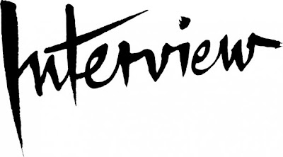

_So while in town today I picked up the new 'Interview' magazine, and it got me to thinking about the logo type re-design and exactly HOW NICE it is - The top image is the new, the bottom is the old. It just such a beautiful development of a classic design.

No comments:
Post a Comment